06 · Editorial Identity
Atlas of Quiet Things
Client
Folio Press
Year
2025
A 312-page anthology re-imagined through a single ligature.
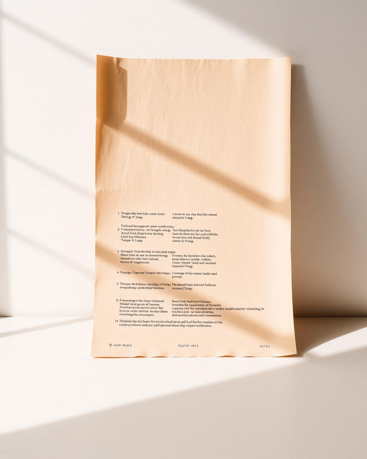
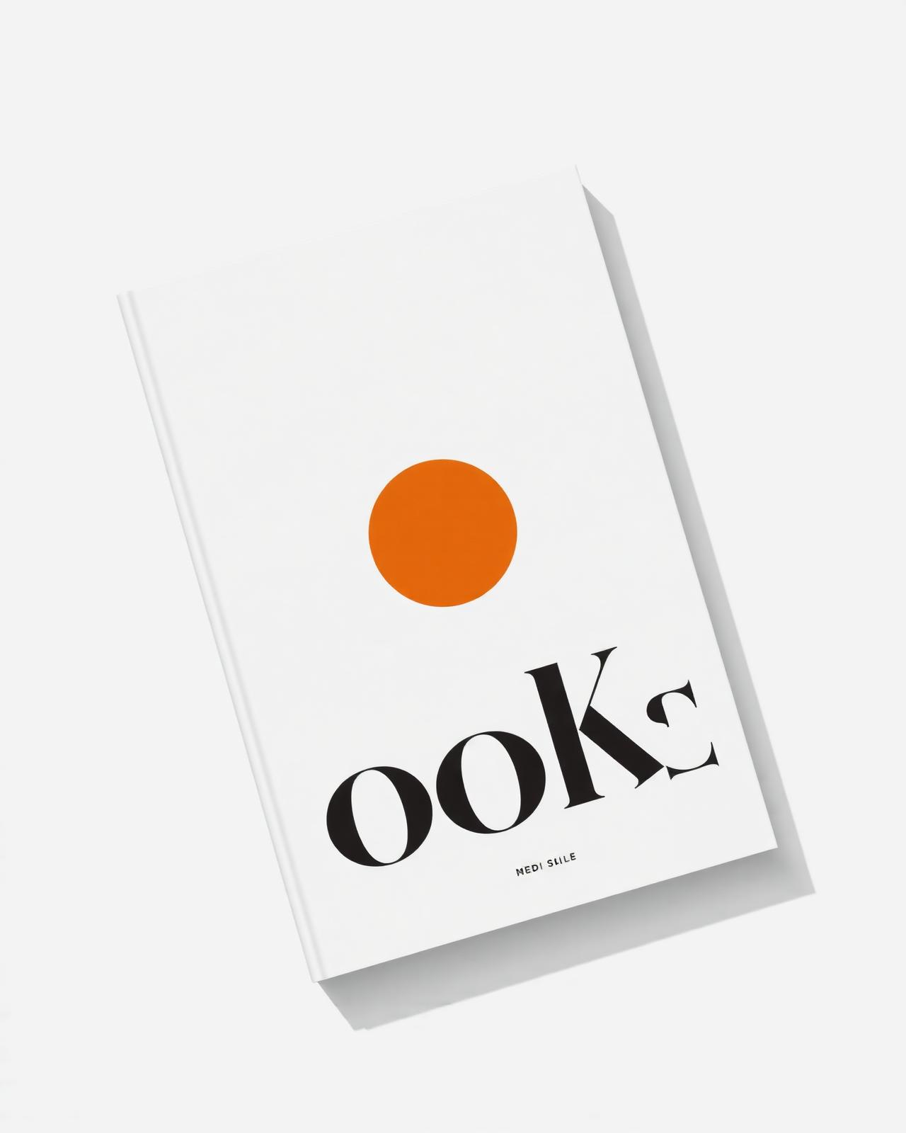
Fig. 01 — The primary monogram set in heavy ink on uncoated stock, built around the tension of a single custom ligature.
Whispered,
not shouted.
Design is often a process of removal. For Folio Press, we stripped the identity back to its most skeletal form, letting the physical material of the page do the heavy lifting.
The typography uses generous white space to anchor the reader and allow the ink to sit heavy on the paper. Each chapter opens on a generative form derived from the cadence of the manuscript itself.
“Silence is not the absence of sound, but the presence of focus.”

Methodology
- 01
Typographic Audit
Reviewed forty serif families to find a weight that survived both 6pt captions and a six-storey façade without losing its breath.
- 02
Material Tension
Tested ink absorption on 120gsm Munken Pure to land a deep, matte black that sits heavy on the paper without bleeding into the fibre.
- 03
Single Ligature
Drew a bespoke ligature that recurs throughout the anthology — at first a quiet thread, eventually the architecture of every chapter break.
Next project