02 · Identity & Packaging
OHANA
Warm, natural and full of personality.
Ohana is a Hawaiian-inspired mushroom supplement brand created for Aloha. The project included naming support, identity design and packaging for a growing range of mushroom-based wellness products spanning more than 30 SKUs.
The visual direction combined warm, natural tones with vibrant colour palettes and hand-drawn illustrations to create something contemporary, approachable and full of character.


Identity
A mark with two readings.
The identity centred around a custom hand-drawn icon inspired by the underside of a mushroom while subtly referencing a rising sun and the Hawaiian landscape.
Typography was kept clean and understated, allowing the illustrations, colour and packaging system to take the lead.
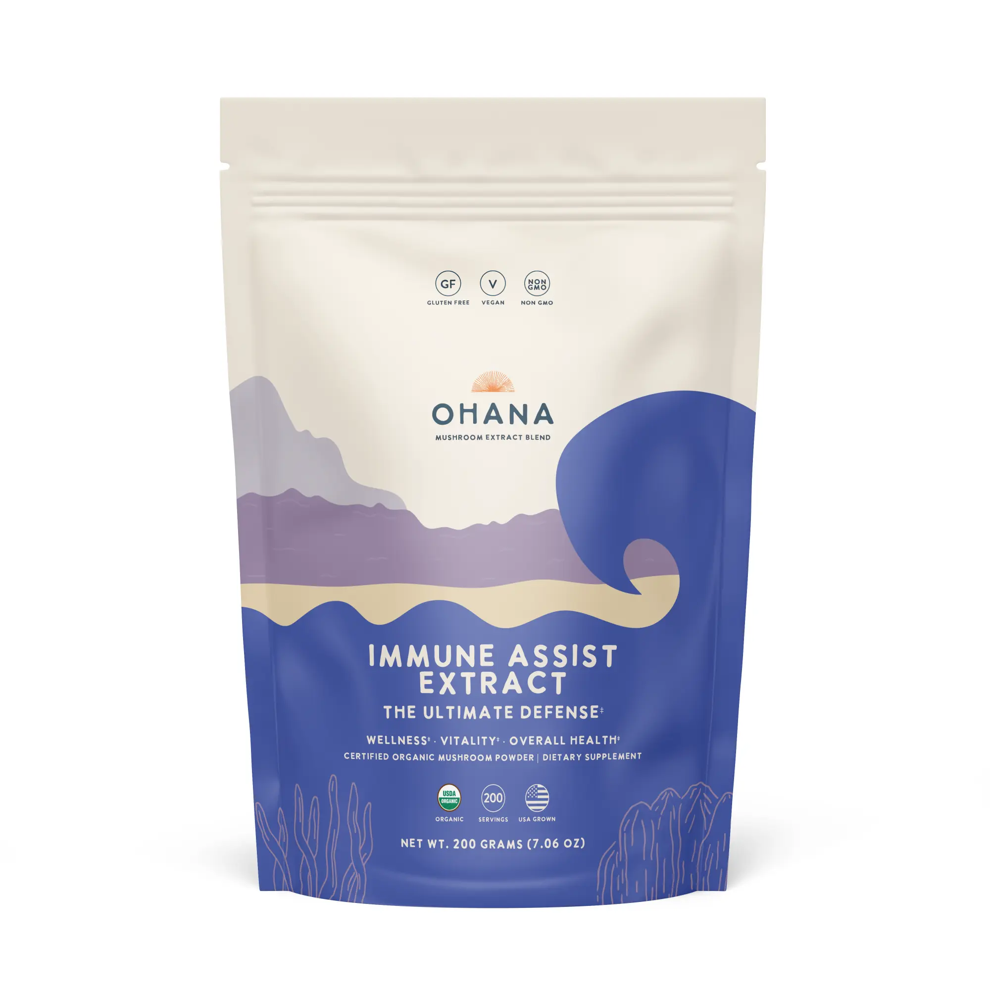
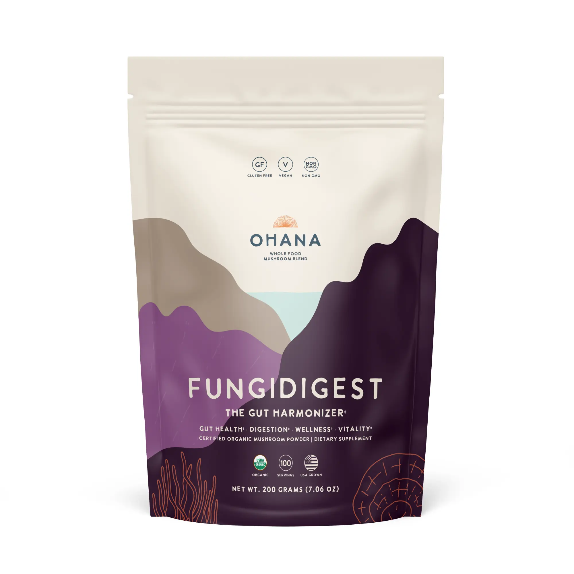
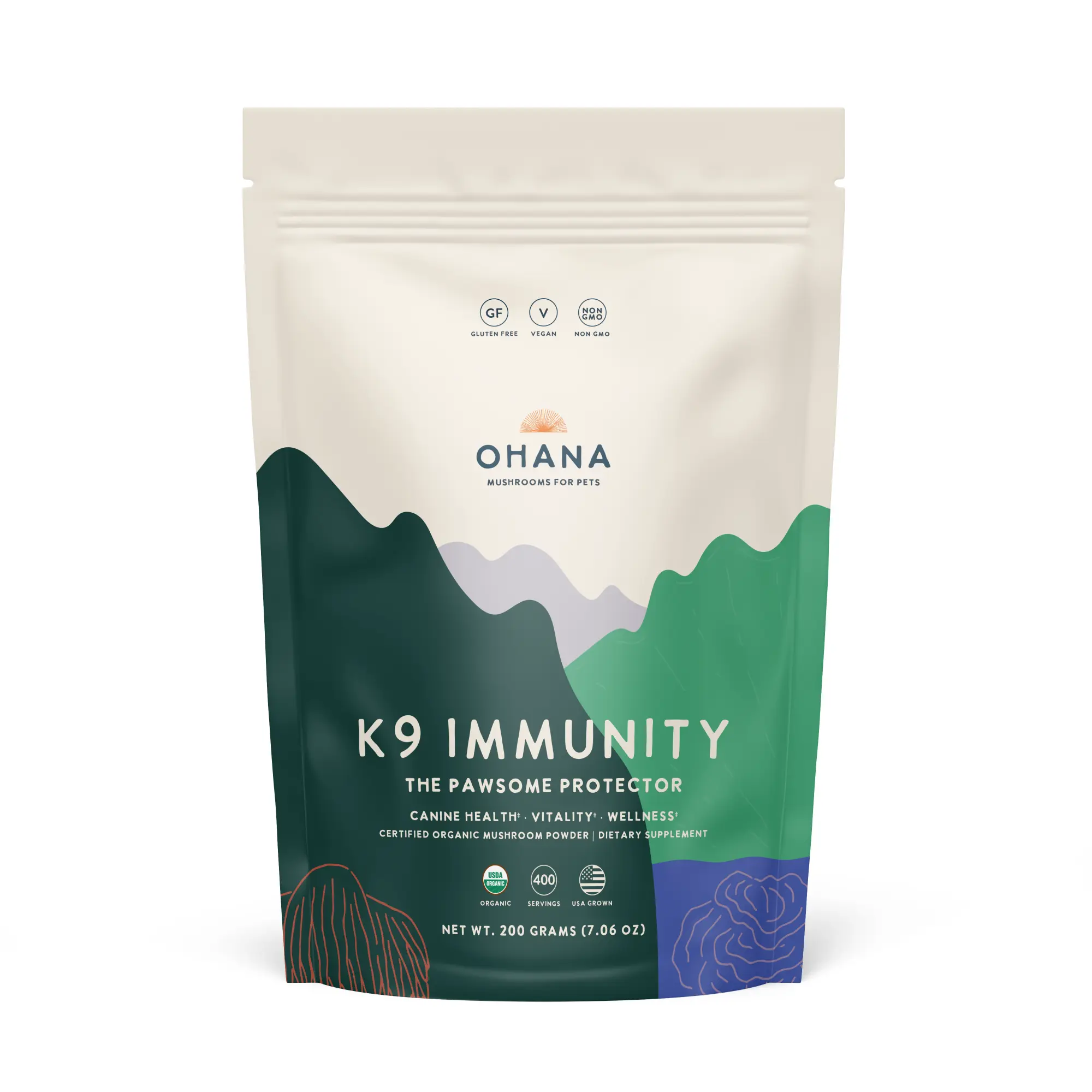
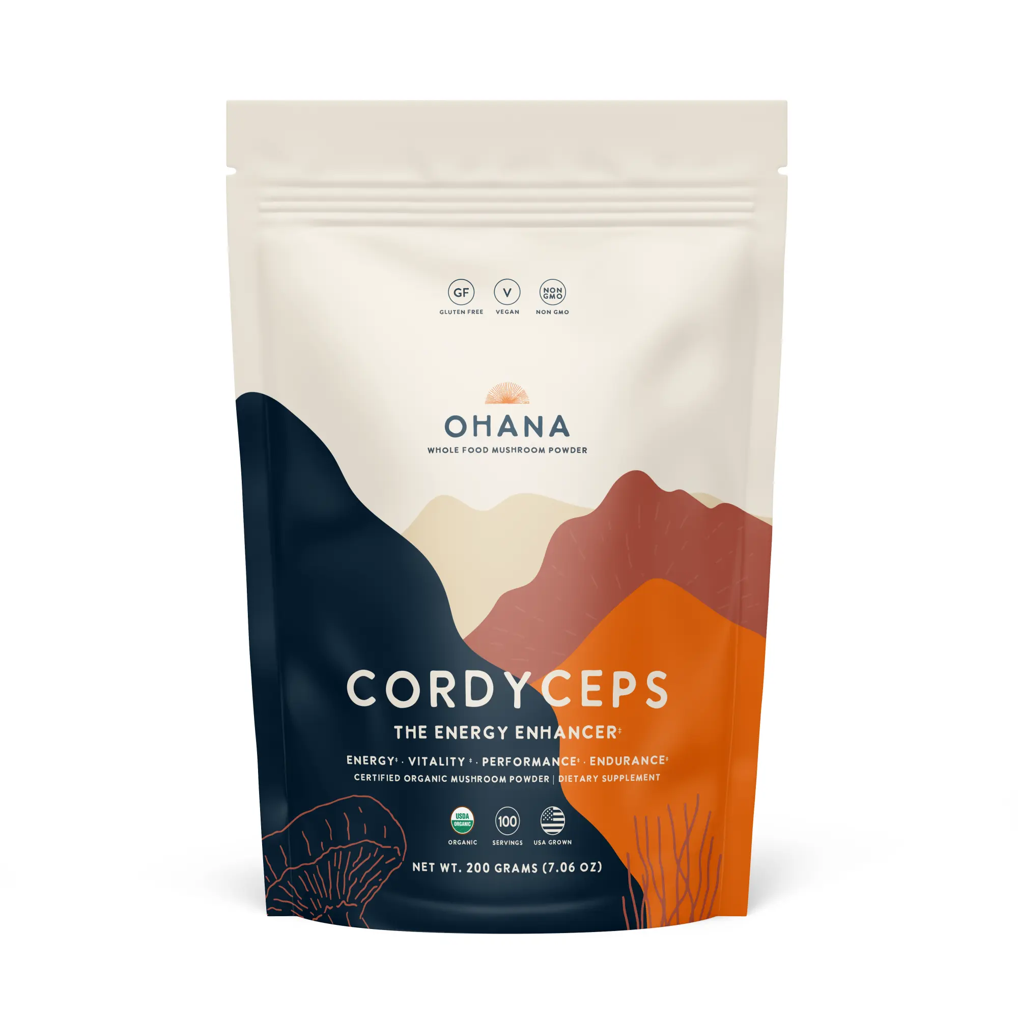
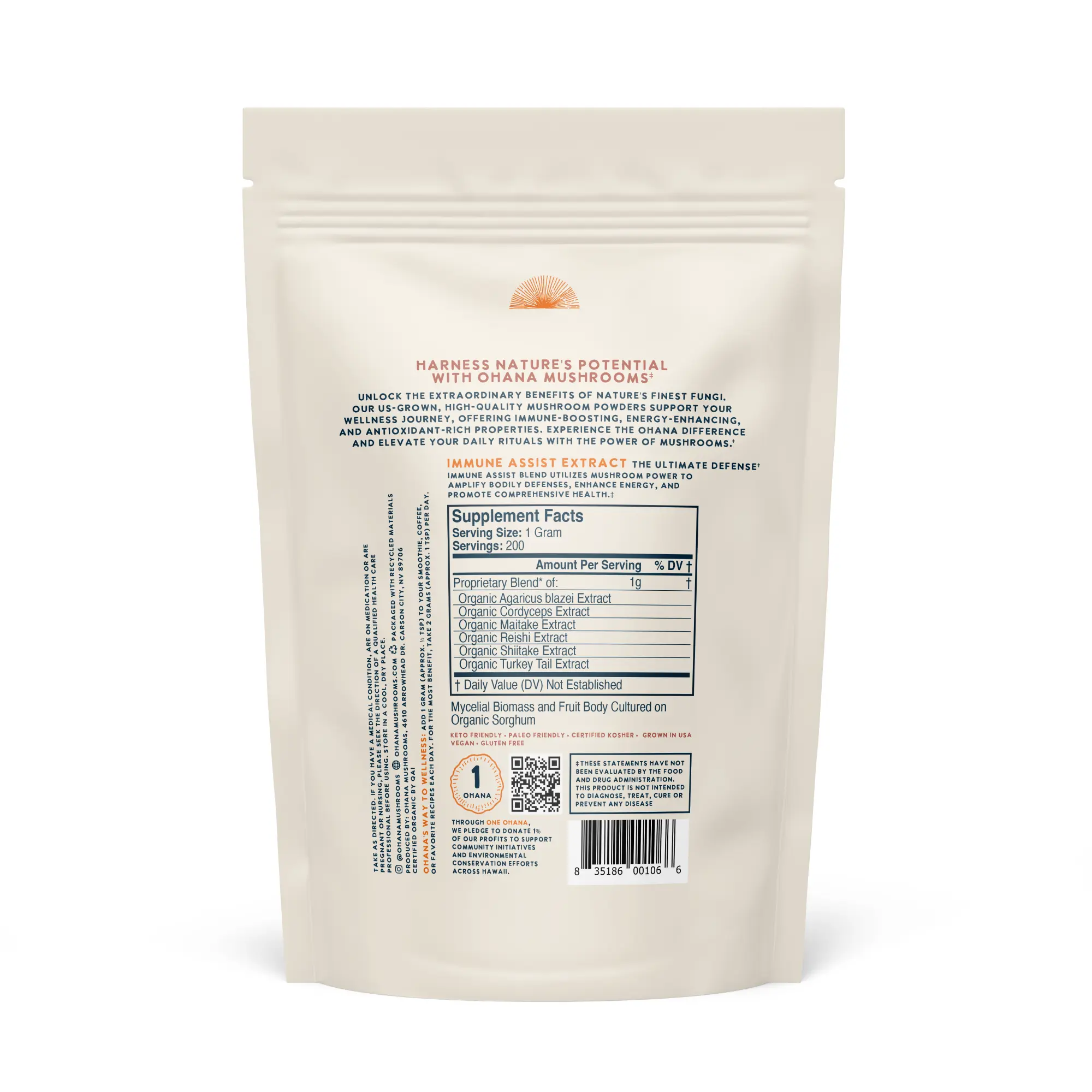
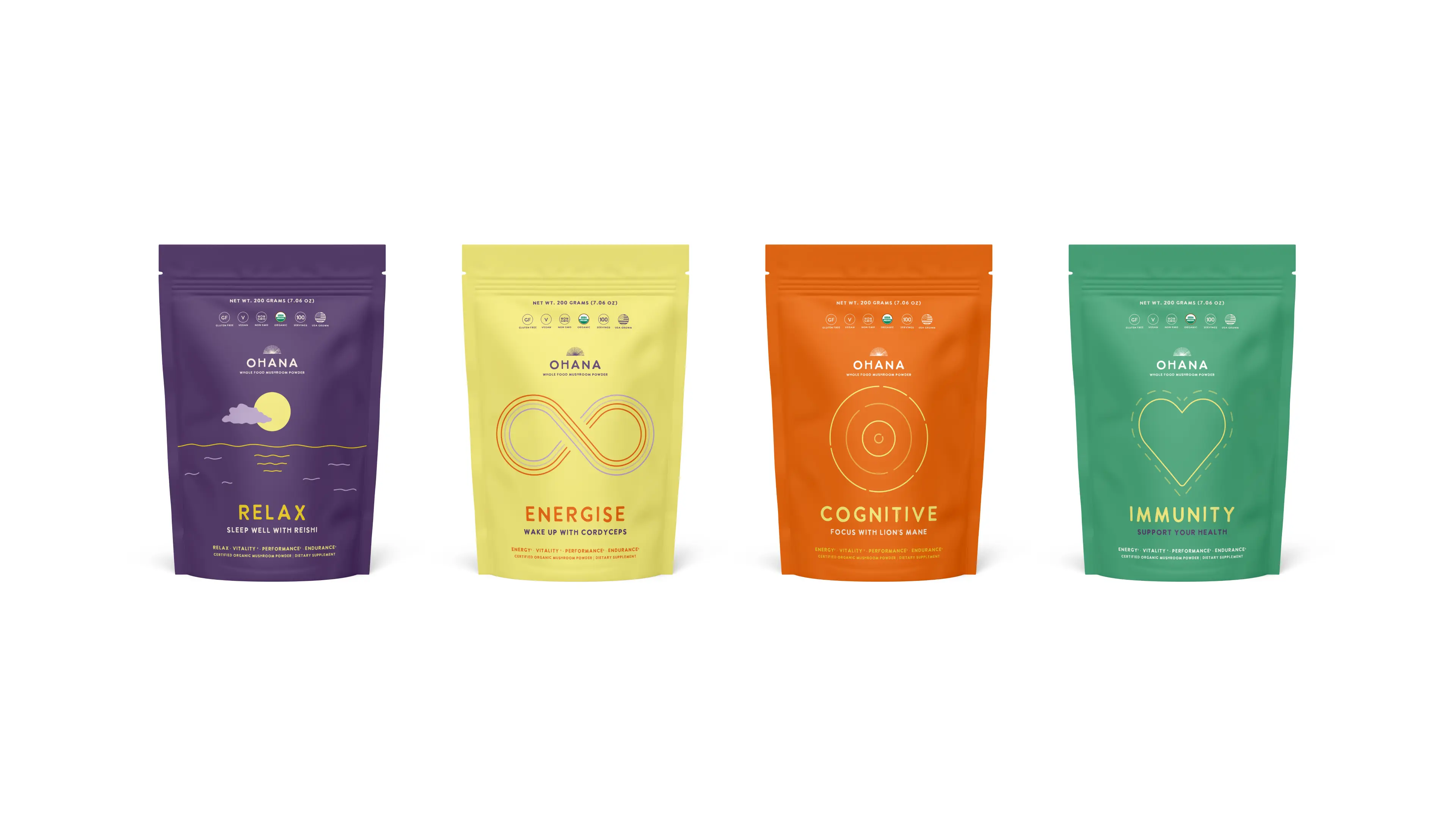
Packaging System
A flexible range for more than thirty SKUs.
A flexible packaging system was developed to support a broad and expanding product range. Each product used its own colour palette and illustrated landscape while maintaining a consistent structure across the wider collection.
The colours were designed to feel warm, fresh and energetic without becoming overly loud or trend-driven. Hand-drawn mushroom illustrations were woven throughout the system, adding texture, character and a more human feel.


Concept Exploration
The route that stayed in the room.
Alongside the final direction, several alternative packaging concepts were explored. One early route focused on simplified symbolic graphics and bold colour combinations. Although it wasn’t selected, it remained a favourite internally and helped inform the playful energy of the final system.
